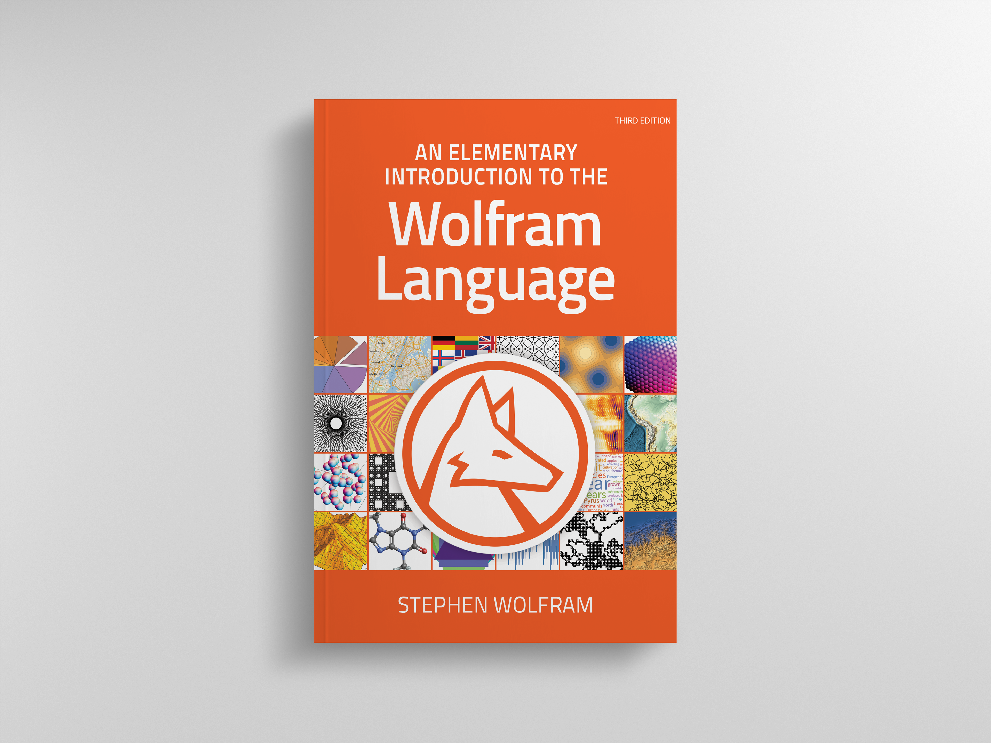
An Elementary Introduction to the Wolfram Language provides an elementary introduction to the Wolfram Language and modern computational thinking. I explored different directions to take this cover while making it an extension of the previous editions. The final result is a colorful display of the capabilities of the Wolfram Language.
The first and second editions feature a photograph, taken by a local photographer, of the Wolfram Language logo that was made with acrylic cut outs. I wanted to keep the orange color-range as the main or accent color to continue the brand identity. The logo also had to be featured on the front so I explored different ways of stylizing it.
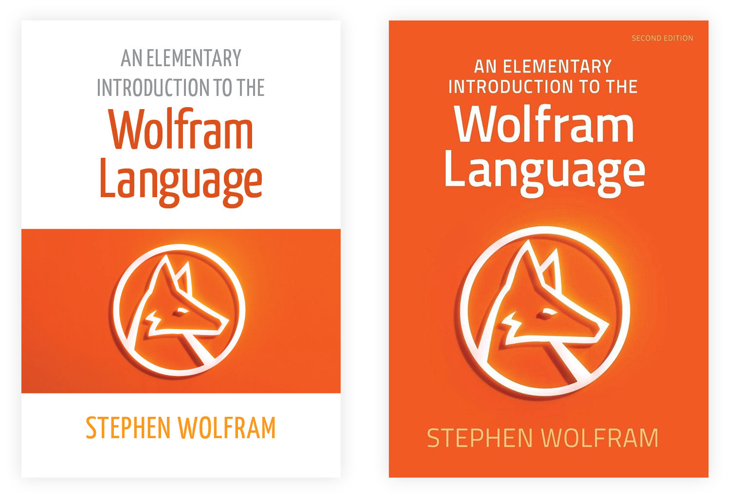
The first round of concept covers presented three ideas. The first is a minimal cover that follows the same idea as the second edition, only with the vector logo and a deeper orange gradient. My goal was to show a visual progression directly from the second edition. The second cover is a white cover that echos the first edition. I like how clean and light the white cover feels. The concept was having a Wolfram Language generated output emanate from the logo. The third cover is similar to the second, but has the output within the logo itself.
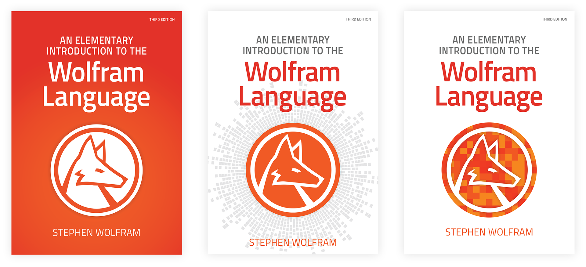
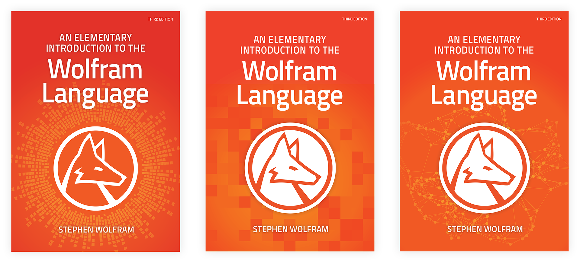
The orange cover was more favored than the white, so the second round of covers focused on what can be put around the logo. The first cover is a reversed version of the first round's second cover. The second cover shows an output that gave a more background texture quality while the third showed a lighter-feeling network. I wanted to see what direction the background could be taken.
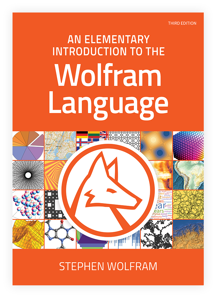
Ultimately it was impossible to justify using a singular output that could represent the capabilities of the Wolfram Language, so the idea of making a collage of many different outputs was suggested for the third round of covers. I was initially concerned with overwhelming the logo with all the small images so I added an overlay to put them in the background more. One version features orange monotoned images while the other shows the same images just in their default colors.
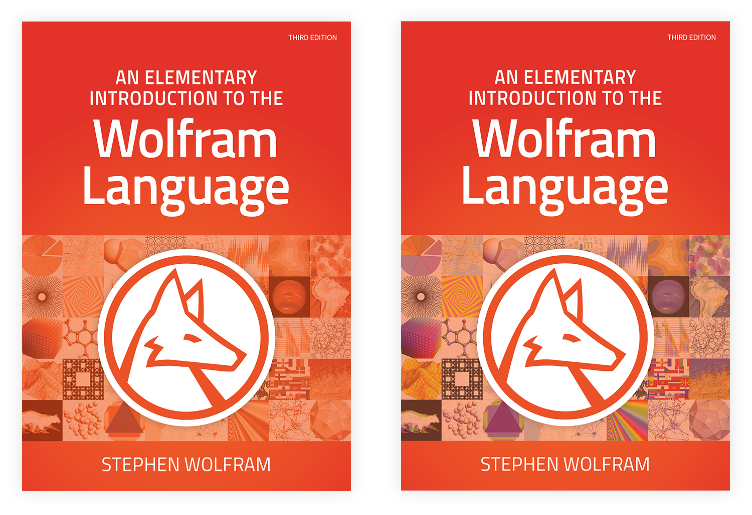
The decision was made to show the image tiles in their full color and to make then larger. A thin border was added to provide separation between images. The orange color was also changed to match the second edition more. Overall, the third edition cover is a colorful contrast to the previous editions and highlights the capabilities of utilizing the Wolfram Language.